I'm generally interested in text layout for couple of side projects so I'm keen to see what Konva can do for me with its Text object. I'm a fan of Konva, and I'm on a journey to understand it in as much depth as I can, and this is a step along the route. My conclusion about the 'why' of the Konva.Text object is that without it, getting more than a few words of text onto the canvas would require everyone thrashing out their own text layout code - a massive waste of human effort.
For its few oddities, Konva.Text doesn't stop at simply getting your text onto the page - there are goodies here for sure.
It gives you
- built-in line-wrap,
- text measuring - very handy to spot overflows
- underline, strike-through, ellipsis,
- alignment within the shape.
But we must note that it does not give you
- A border or box
- A background color
- Multi-font text,
- WYSISYG user input
The items in the list of missing features kind of guides when it is useful, or not. For example, if you need a simple label for something on your stage then the Konva.Label is probably what you need. It has a moveable pointer, borders and colors built-in. Or if you need text on a path, try out the Konva.TextPath.
The final couple of points in the missing features list are harder hitting. Without multiple-font rendering then you will not be able to apply bold, underline or italic, nor use another font or color, to provide emphasis. You are stuck with one font family, one size, one color, all-bold, all-italic, etc. And without an input control users can't type data into your app.
But we should pause at this point and consider these points - I don't think they are negatives and here's why. The Konva.Text shape is a wrapper for the plain HTML5 Canvas fillText() and strokeText() functions. These basic canvas functions can do almost nothing other than place a string of text at a point on the canvas using the given fill or stroke. That's it. No line breaks, horizontal or vertical alignment, ellipses, etc. And, of course, they are a one-way deal that will put text on your canvas but leave you with no 'handle' to any object that can change or manipulate that text over time. Conversely, our Konva.Text object solves most of the real-word issues that you would find yourself having to code yourself if you needed a viable Text object to overcome those shortcomings.
Perhaps the most widely voiced issues around text are multi-font output and WYSIWYG user input. These are not built in to the Konva.Text object and for good reason. The multi-font layout requirement is a massive challenge - and the WYSIWYG user input even more so. Put bluntly, the creator of Konva had to stop somewhere realistic with text features and what we have now with the trio of Konva.Text, Konva.Label and Konva.TextPath objects is a workable trade-off between covering most of what people need and leaving the WYSIWYG-style features to the after-market.
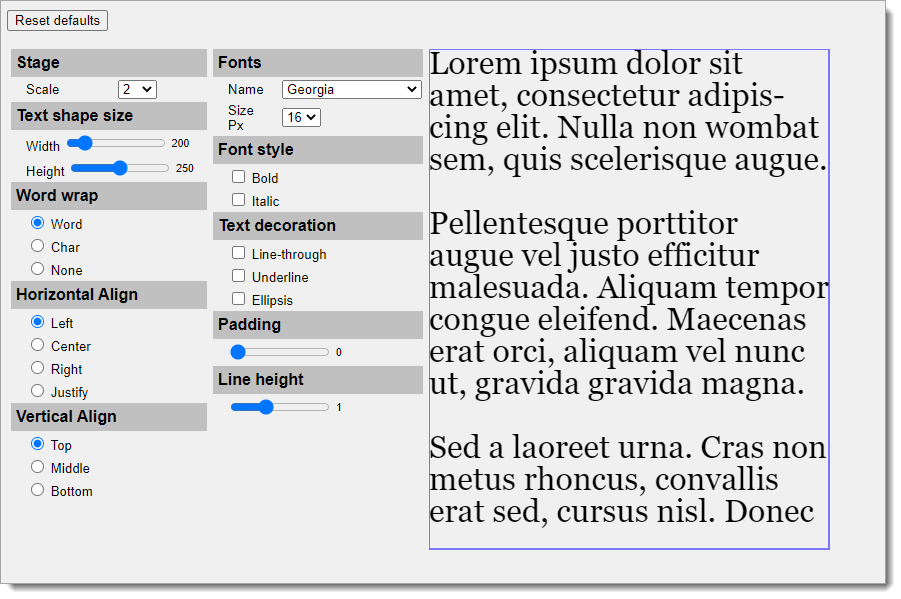
Ok - lets look at some code. Here's a pic of the utility I wrote for feeling out the nuances of working with the Konva.Text object. I'll be referring to it as we go along so you might want to open it now. - I recommend using the 'Edit on CodePen' option as you'll want to run it full-screen. What it does is to let you change various of the Konva.Text parameters individually or together, and observe how the output changes in response. Note I'm using a mix of older web-safe fonts and web-fonts from Google - we'll be looking at the practical differences of those later in the article.

Just looking at the docs for the Konva.Text for a moment, here's they say for the Konva.Text constructor from the Konva Github. This is largely the set of features that we are targeting in this article.
 * Text constructor
 * @param {String} [config.fontFamily] default is Arial
 * @param {Number} [config.fontSize] in pixels.  Default is 12
 * @param {String} [config.fontStyle] can be normal, bold, or italic.  Default is normal
 * @param {String} [config.fontVariant] can be normal or small-caps.  Default is normal
 * @param {String} [config.textDecoration] can be line-through, underline or empty string. Default is empty string.
 * @param {String} config.text
 * @param {String} [config.align] can be left, center, or right
 * @param {String} [config.verticalAlign] can be top, middle or bottom
 * @param {Number} [config.padding]
 * @param {Number} [config.lineHeight] default is 1
 * @param {String} [config.wrap] can be "word", "char", or "none". Default is word
 * @param {Boolean} [config.ellipsis] can be true or false. Default is false. if Konva.Text config is set to wrap="none" and ellipsis=true, then it will add "..." to the end
All of these parameters are optional - even text, although it's hard to foresee why it would be useful to miss that! By the way, you can see that the text I am using is a bit more challenging than 'Hello world' - we're throwing paragraphs with multiple lines in to the mix to see what Konva does.
From here on, lets take a look at some of the features of the Konva.Text object. Unless otherwise instructed, stay with Georgia 16 for the font settings.
Text only
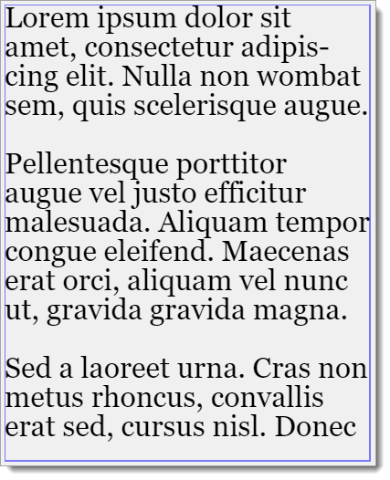
Click the 'Reset defaults' button, and then manually set the scale to 1, and the width & height sliders to 0 (meaning unlimited). The image below shows the expected result - note the blue outline is a rectangle shape drawn around the text shape so we can visualise the extent of the text shape. There is no built-in way to get a border around text, though a Konva Label does this and so can be a useful solution if your needs veer toward simple labels.

The configuration now set is just about as minimal as it gets. With unrestricted width and height set, the text can range off to the right as far as it wants and there will be no line wrapping. This includes ranging off the canvas. This will be a very common config for small labels or similar pieces of text, such as graph axes markers, where you know for sure that the text to be output is short and no wrapping considerations are necessary.
This result would be quite easy to reproduce with pure canvas API calls since there is nothing special going on in terms of layout. However, remember that the pure canvas API calls do not provide a handle back to the text object for later updates.
Width & the Rappers Delight*
It is more usual to have to set a limit to the width that the text can use, and to want your text to wrap when it exceeds that length. Set scale to 2, word wrap to 'Word', then move the width slider to 360 and see how, as you drag the slider, the text wraps onto multiple lines and extends vertically down the page as you do so. Because we still have the height slider at zero (unlimited), the Konva.Text object is free to be as tall or short as it needs to output the text in full. We'll look at the effects of setting a height limit shortly.
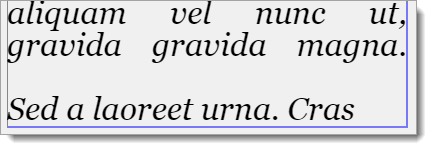
There's no real mystery to the line wrapping, its just a case of knowing when the maximum width is reached and incrementing the y-position by one line height . There's a small complication that the first word on a wrapped line should not be a space, and that when a word is a candidate for wrapping then if it has a hyphen, like 'bitcoin-scandal', then it is allowed to be broken at the hyphen if the pre-hyphen word length plus the hyphen stay within the total line width. See paragraph 1, line 1, word 7 for an example of this behaviour. See below for a pic of para-1 of the output.

Now change the word wrap setting to 'char'. The difference this makes it to the line wrapping algorithm is that in 'word' mode it is constrained to line wrapping so that whole words are maintained. But in char mode the algorithm is allowed to break lines at whatever character in a word is nearest to the width limit. My own opinion is that this is less-usable in the real world as the convention for line wrapping is to break-on-words.

Look at the right hand side of the images above where the differences in the wrapping algorithms results with these different settings are on show.
Finally on word wrap, change the setting to 'none'. None tells the wrapping algorithm to continue to work out the last character that fits width-wise on each line, but truncate whatever comes after it. Look closely - there are no partly-drawn characters on that right edge of the text output.

There is no pure canvas API feature for line wrapping, so +1 for Konva.Text.
Ellipsis
And while we're here, toggle the text-decoration 'ellipsis' option. The result is shown below where at the right hand edge the lines that are truncated - in this example all three of them - now have dandy dot-dot-dot characters to indicate an overflow.

There are a couple of points to note here. Firstly, having the ellipses as an overflow indicator is good, but there is no way to scroll or reveal the overflowed text so if you use this feature then you probably have some coding to do to cover that issue. And a vertical overflow will not generate ellipsis.
Height
Click the 'Reset defaults' button - your text should be laid out as shown below. Notice the foot of the text box - we appear to be missing some of paragraph 3.

This is because we have a hard height restriction set of 250 pixels - and Konva is following the same thinking around height overflow as it does for width overflow. That is, it will truncate any text where part of it would fall outside of the prescribed width and height. For the width, Konva can wrap the line (depending on settings!) but for height there is no equivalent option so the text that overflows is clipped / not output / not visible!
As an aside, whatever approach you take to overlong text, there are no simple answers. I once wrote a system to allow customers to create their own leaflets online. We decided that if the customer put too much text into a box and the excess got truncated off then they would surely notice before confirming the order. No! We had a big customer with a £50,000 order placed where the contact number for the business was on the last line at the bottom of the page and it got clipped just like our para 3 above. The good news was that the printers caught it, but it was nearly a very costly assumption we made on the UI side of things.
Anyway, Konva does a decent job of managing the text layout without imposing any opinionated messages about overflows etc. If you 'do' need to know when an overflow happens, do the following: set up a shadow text object that matches the target text object in every way except do not add it to the layer, and importantly make its height 'undefined' which will allow Konva to make this (invisible) text output as high as it needs to display the entire text you provide to it. Now set the text() property of each of the original Konva.Text object and the shadow version, and compare the height() property of the two boxes. If there is a difference then you have an overflow condition and some of the text is being clipped from the visible text output.
Alignment
Continuing with the same settings, click through the horizontal alignment settings from left to justify and observe the effect on the output.
Now click through the vertical align options ending at 'bottom'. To me there is a small brain jolt here as I had expected that setting 'bottom' would expose the previously truncated bottom portion of para-3 at the expense of some of the first lines of para-1. The same thought stands for the 'middle' option when I expected to see parts of paras 1 & 3 truncated.

Underline
It may come as a shock to some people, but fonts don't have an automatic underline capability. In raw-canvas API, you have to calculate where the line should be and draw it yourself. Fortunately, Konva takes care of this for us. Unfortunately, on some of the more flamboyant fonts, the algorithm for determining the underline position goes a bit off track - note this is more about the font than Konva. Reset to defaults again, switch scale to x 4 then change the font to 'Droid Serif' and enable underline.
There is another brain-jolt for me here as I had expected that the underline would follow the same approach as MS Word and similar, and be just below the baseline of the text - however, as you can see, Konva takes the approach of placing the underline below the text box itself. This is perfectly usable but may not be what you expected. If you require the baseline underline then calculate the baseline position and width and add your own Konva.Line as needed.
Because of this approach, you may find that the underline from line-1 runs into the top of the taller characters from line-2. In this case you may want to set the lineHeight parameter to something > 1. A value of 1.1 - 1.2 gives a readable result.
Line-through
The line-through feature operates well, drawing a line through the text. It is possible to have both underline AND line-through enabled at the same time, though this is probably of limited value. Remember that you cannot have line-through applied to a single word in a paragraph or sentence - because of this, this feature is actually of less use than you might initially think.
Padding
Reset to defaults and use the padding slider to increase the passing from zero 10 pixels and note how the text moves to the right & down, and also how the line wraps at a shorter position.
Padding is useful as it adds a padding area between the sizes of the text rectangle and the text itself. There is no X & Y separation - the padding value you set applies to both axes and is a pixel value. You can achieve the same effect with different X & Y values by simple math around the location and width of the Konva.Text object.
Line-height
Reset to defaults and use the line height slider to increase the line height from the initial value of 1 to 2. Note how the gap between lines increases with line height.
If you have a large body of text, you will usually prefer a line height of 1.1 - 1.2 as this gives a more appealing and less-dense appearance.
Bold, italic & Variable Fonts
I've saved bold & italic to last as there is a difference in behaviour between some of our old web-safe fonts and the newer variety of web-fonts such as are provided by Google.
Variable fonts (a newer variety of web-fonts) are the future of web typography - there's a great & detailed explanation here.
My simplified version is this - in the pre-variable font days, if you wanted to use a plain (aka Roman) version of a font, and maybe have some words in italics and perhaps a bold title, then you needed three font files - one for the Roman version, one for the bold and one for the italic. That would have been a costly data download for the fledgling web, so we leaned toward web-safe fonts which were fonts you could reasonably expect to find already installed on early web browsers, thus saving the file transmission cost. Meanwhile, as the web expanded and designers wanted more freedom with text layout and design, someone noticed that a bold character in a font shares many of the traits of the Roman version - the bold version is simply 'fatter'. The same follows for italics - an italic character is a Roman character with some slant. Could it be possible then to provide one font file - the Roman version - and have it coded with behaviours so a browser-based text drawing engine could synthesize the bold and italics from that? Yes - meet variable fonts. Variable fonts will give you a range of weights and italics without the need for virtual duplicate font definition downloads. There is a slight uplift in file size for these new features.
Back in our demo, reset the defaults and look at the top line of para 1. which should end in 'sit'. Confirm you are using Georgia font, and now click the 'bold' checkbox while watching that top line. Notice how much nearer the word 'sit' is to the right hand boundary ? Georgia is an 'old' web-safe font - the type with a file per font style, and what you are witnessing is that the Georgia bold was handcrafted with more inter-character space than the non-bold version, meaning each character got slightly wider and so each word takes up more space. The same happens with Arial - another web-safe font.
[For this next part you will need a browser that is variable-fonts capable, for example Google Chrome]
Now switch off the bold selector and change the font to 'Catamaran'. This is a variable font - apply bold and notice that the text stays put. When the bold is applied the heavier font characters are synthesized from the Roman version, so nothing appears to move as it did with Georgia.
You can repeat the test with the italic setting and you will see the same effects, though they are less dramatic.
Summary - the Konva.Text object seems to operate with any standard web font technology including the new variable web-fonts approach.
Other Konva.Text parameters
I'm skipping looking in depth at many of the Konva.Text parameters otherwise this article would be extremely long! Some notables are:
- fontVariant: the docs say 'can be normal or small-caps. Default is normal' - its hard for me to imagine when I might use this as it replaces the given text by a smaller font all in caps;
- fill / stroke / fillAfterStrokeEnabled: if you need to fill AND stroke your text then this may make a tidier result;
- fill options: there are a great many fill pattern options available if you need them;
- shadows: there are a bunch of parameters for use and appearance of shadows;
- performance: for better performance think about switching off event tracking by setting the listening parameter, and enable caching on the text shape.
Summary
The Konva.Text object can be used to display long sentences or paragraphs of text, automatically wrapping the text at a specified width. Once created, a Konva.Text can be altered - for example alignment or text - and at the next redraw those changes will take effect.
The Konva.Text object blows away the basic HTML5 canvas API text output capabilities with many time-saving and advanced features that would need to be coded for each use case if the HTML5 canvas API text output were to be used.
If you need simple labels, look at the Konva.Label object, and for text on a complex path see the Konva.TextPath object.
Thanks for reading.
VW March 2021
Footnote: It's generally agreed that 'Rappers Delight' by the Sugarhill Gang was the first Rap song. Although there were earlier recordings knocking around New York, this was the first on proper vinyl. It was a very small hit in the US but quite big in the UK. I remember them on Top Of The Pops. Blondie had the first breakthrough rap with Rapture. Novelty rap singles followed including the Hitler Rap (Mel Brooks), The Snot Rap (Kenny Everett) and the Stutter Rap (Morris Minor & the Majors). The Guardian


