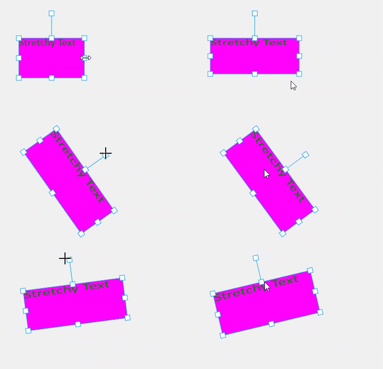
Taking a look at how the Konva.Transformer works and how it can be styled.
Any app that involves drawing shapes is going to need to transform them - make them wider, taller, rotate them, etc. Typically that means you have to show which shape is the focus for the transformation, then provide some ‘handles’ at the corners and edges for the user to manipulate in order to make the transformation. Oh, and don’t forget the rotation feature. Next you’ll need to track all the events and give decent visual feedback on what the user does, plus make it all stick when the transformation completes.

Quite a lot of work - unless you have the transformer, which does all of that apart from the make it stick part.
See the full documentation for the API details - I’m going to show you the basics and point out a few useful bits and pieces to make your learning curve shorter. But we'll develop a working demo in vanilla JS that you can use in your own projects, and I'll provide a styling sandbox to help you to visualise what each property does.
Before we get into the transformer lets set some shapes on a canvas. Konva is a wrapper for the HTML5 canvas element. Well, saying that is like saying Lewis Hamilton drives a car. The official intro says:
Konva intro page
Konvais an HTML5 Canvas JavaScript framework that extends the 2d context by enabling canvas interactivity for desktop and mobile applications.Itenables high performance animations, transitions, node nesting, layering, filtering, caching, event handling and much more.
Konva uses a Stage to represent the canvas, with Layers holding shapes. In this demo I am also using a Group which is a Konva feature that allows us to glue shapes together for convenience. See the code below wherein I create a Rect and a simple Text element then group them to give something like a simple tooltip or text label.
The code is refreshingly straightforward and just about as minimal as it can be whilst retaining developer control. The last few lines, copied below, are worth considering. The variable tr1 is the Konva.Transformer. To actually make an appearance in any meaningful way it has to have one or more shapes (aka nodes) connected to it. That is accomplished at line 2 below where a single-member array is passed in as the parameter to the transformer’s nodes method. This associates the transformer with group1.
// Finally connect the transformer to the group
tr1.nodes([group1]);

// Set the group x-scale to mimic a horizontal stretch by the user
group1.scaleX(2)
At line 5 I’m setting the x-scale of the group to 200% – this is not something you would normally need todo, and I am only doing it to illustrate the text-stretch affect. Run the code if you and stretch the shape horizontally to witness this. In essence, this is what the Konva.Transformer is there to do – transform the shapes it is associated with as dictated by the user.
How it works
I’ll mention this because some folks miss this point and it’ll save you some confusion later. For stretching transforms, so that means making the shape wider/thinner or taller/shorter, the transformer works by setting the scale of the shapes it is transforming.
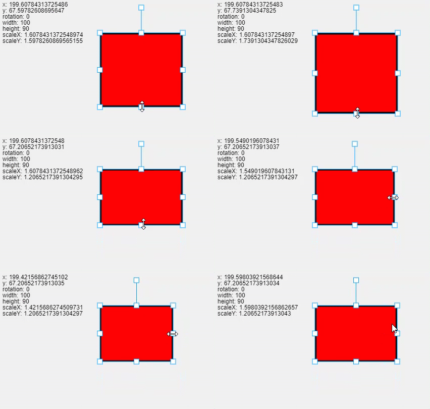
You can go ahead and confirm that for yourself at the official Konva docs on the about the Transformer where there's a demo of a transformer working on a simple rectangle and the details of the rect are printed as the transform occurs. This is what it looks like – pay close attention to the width and height and scale X & Y.

As you can see, the width and height do not change - only the scales do. By the way, Konva gives the stage, each layer and each shape two scale factors - one in the horizontal direction and the other in the vertical. Namely scaleX() and scaleY().
What you see happening here is an illustration of ,the point that the dimensions of the shape being transformed DO NOT CHANGE. Only the scale(s) changes.
This is important because in canvas work you usually want to know the position and dimensions of the shapes, and the transformed shapes will not appear to have been altered if you just rely on its position and dimensions.
So how do I get the transformed dimensions? Easy - for the width you need to use shape.width() * shape.scaleX(). Same for height.
Transformer properties
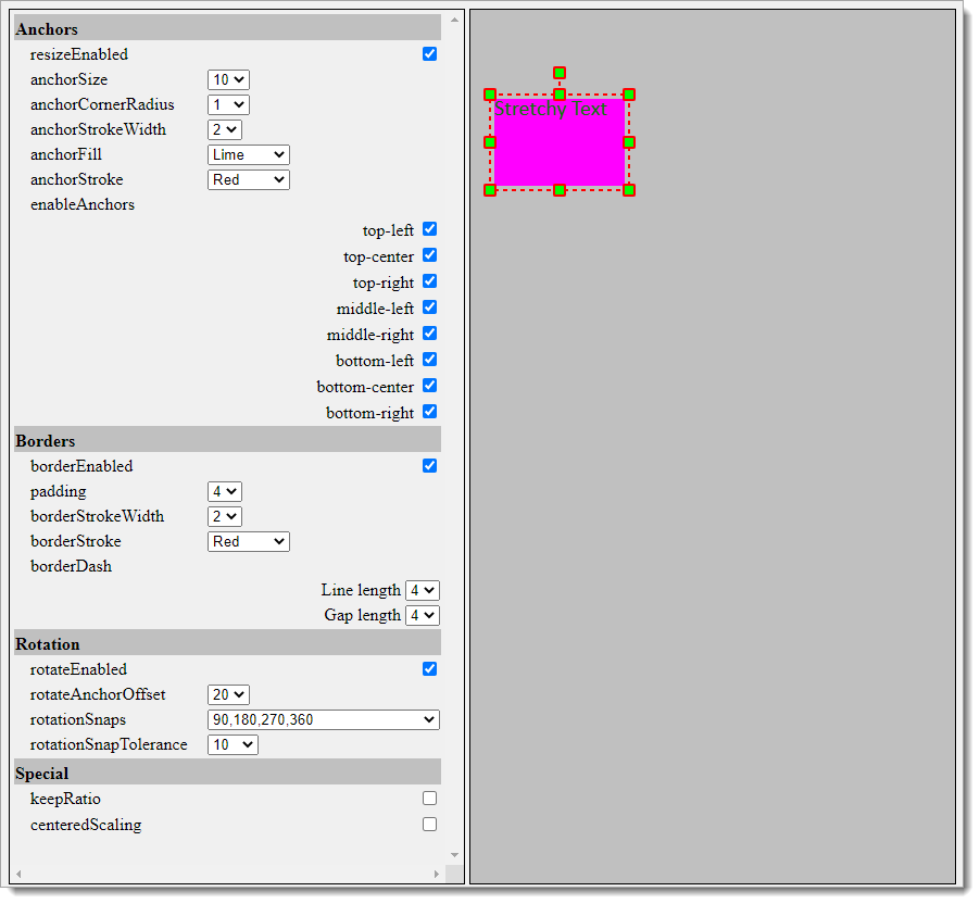
I'll run through the various properties that affect the appearance of the transformer. These can be given to the transformer at time of creation, or set via the same-name methods. To help you get an understanding of what the properties do, I've created a config sandbox demo here, screen grab below. You can alter the properties individually and observe the effect.

Anchors
The following parameters control the presence and appearance of the sizing handles, aka anchors.
- resizeEnabled: controls if anchors are visible (true) or not (false). Default is true so you can usually ignore this property.
- anchorSize: sets the size of the anchors
- anchorCornerRadius: by default the anchors are square - set the corner radius to give them round corners or to become circles.
- anchorFill: sets the anchor fill color.
- anchorStroke: sets the anchor stroke color.
- anchorStrokeWidth: gives the anchor stroke width.
- enabledAnchors: taking an array of anchor names, this property is used to control which of the anchors are visible. By default you get eight anchors - one at each corner and one in the centre of each edge. A common use case is to remove the middle anchors to reduce UI clutter and show only the corner anchors. The value to give for this case is ['top-left', 'top-right', 'bottom-left', 'bottom-right'] .
Border
When a transformer is enabled it is useful to show that the focus is not on the transformer. To do this we have the transformer border, with the following properties:
- borderEnabled: if you prefer not to have a border then set this false and voila - no border!
- padding: usually the border is drawn on the edge of the transformer. Set this parameter to move the border out slightly - think of it like margin in CSS.
- borderStrokeWidth: operates like strokeWidth, setting the pixel width of the transformer border.
- borderStroke: sets the color of the border, for example 'red'.
- borderDash: By default when a border is in use it is a solid line. Setting the borderDash pattern gives a dashed-line effect. This property requires an array of the on / off lengths, for example [2, 2].
Rotation
By default the transformer also provides a rotation function. The following properties affect this feature:
- rotateEnabled: To hide the rotation handle, set this property false. Now the users cannot spin the transformer.
- rotateAnchorOffset: sets the length of the stalk for the rotation handle. The default is 50 pixels.
- rotationSnaps: If you need to give the user a clue about sensible rotations, use this property to pass in a list of appropriate rotations in degrees. For example, [0, 90, 180, 270] will cause a 'snap' effect at each 90 degree step.
- rotationSnapTolerance: if you are using rotationSnaps then this property adjusts the distance that the rotation handle will jump to the next snap point. The tolerance value is a percentage. If you are using 90 degree snaps, a value of 10 works well. Default is around 5 meaning very little snap-jump.
Special Features
The last two properties give special powers to the transformer.
- centeredScaling: when set 'true' this causes the scaling to be mirrored through the centre of the transform, which means that if you drag the bottom edge handle down the top edge handle will move by the same amount. The default value is false.
- keepRatio: this property affects the corner anchors only. What it does is cause the width and height to change proportionally as a corner anchor is dragged. This is often used when hiding middle-anchors using enabledAnchors so as to keep text from being stretched. The default value is false.
- shouldOverdrawWholeArea: if you have multiple shapes in the transformer then you will find that you cannot drag the transformer by clicking on the empty space between the shapes. This recent property solves that problem - set it to true and the whole transformer area will be available for drag. There is a downside though - this setting effectively puts an invisible rect over the top of the shapes in the transformer, which means that those shapes cannot receive their events such as click, mouseover, etc. These are available as soon as the transformer is removed or the setting is set false. The default value is false.
The other option to make the transformer draggable via empty space and allow the shapes to receive their events is to place your own transparent rect in the background. This is an advanced approach - ask on Discord for pointers. - flipEnabled: this setting effects the behavior when the anchors overlap. Think about dragging the bottom-right anchor upwards and left toward the top-left anchor. As you do this, the scale is reducing from 1 toward zero. What happens when the corner anchors cross? Good question. The scale continues to reduce, from zero to an increasingly negative value. That has the effect of 'flipping' or inverting the shape. If your shape has text, that text will appear backwards and upside-down. To stop that, set flipEnabled to false - its default value is true. In this case, as the anchors cross, the position and scale of the shape will behave as if the top-left anchor was being dragged instead of the bottom right. This, of course, works for all of the anchors.
Setting the properties
It is usual to set the properties at time of creation of the transformer, as shown here:
let tr = new Konva.Transformer({
    anchorSize: 10,
    anchorCornerRadius: 5,
    anchorFill: 'red',
    anchorStroke: 'black',
    anchorStrokeWidth: 2,
    enabledAnchors: ['top-left', 'top-right', 'bottom-left', 'bottom-right']
    })
and if you need to update the settings after creation of the transformer then use the functional version of the property, shown here.
tr.anchorSize(10);
tr.anchorCornerRadius(5);
tr.anchorFill('red');
tr.anchorStroke('black');
tr.anchorStrokeWidth(2);
tr.enabledAnchors(['top-left', 'top-right', 'bottom-left', 'bottom-right']);
...
stage.draw();
Remember to update the stage to see the effect of what you changed.
Summary
In this article we've taken a brief look at the Konva.Transformer, and how to style it. Using a transformer saves a ton of time over any DiY approach you might use as an alternative. The Transformer is just one of the effort-saving capabilities of the Konva library and I urge you to read up it about it at the official docs at Starting with Konva.
In the next article I'll look at how to transformer a label without stretching the text, including text rotation. I'll also post something about how to rotate a Konva shape around any point in the stage, which is a useful capability to have to hand.
Thanks for reading.
VW Dec 2020
Photo by Dmitry Grigoriev on Unsplash


